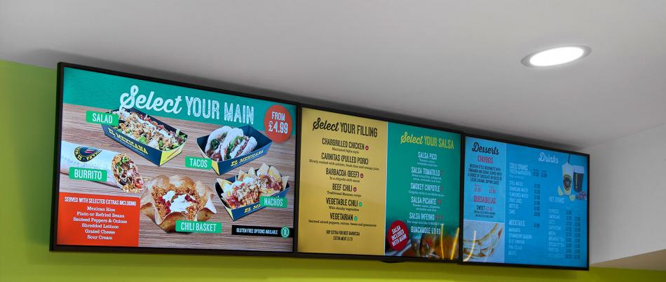
‘Think before you create’ is a great motto to bear in mind when designing digital signage content. Identifying your audience demographics, knowing the location and position of your screens, and the message you want to display is the easy part. But getting the design aspects right is vital to maximising your engagement with your audience whether they are teenage consumers, staff, older generation hotel guests or primary school students.
The success of your digital signage content can come down to five key design principles:

Font
The type and size of font you use is important. Is it legible? Use classic fonts that are easy to read, they are popular for a reason – they are easy to read and understand. Fonts such as Arial and Helvetica are ideal, while creative fonts like Comic Sans or any handwriting or serif fonts are more difficult to read.
Colours
Brand guidelines aside, the colour you use throughout your display needs to be easy on the eye; eye-catching not blink worthy. While a single colour can be used as the dominate colour, the colour wheel can be used for complimentary colours (the colours opposite on the wheel work best). Alternatively, popular combinations using black, red, yellow and white have been proven to be successful and are used by some of the largest brands in the world (McDonald’s, Shell, KFC, Coca-Cola, Nike).
Multimedia Type
Availability of a moving image can have an impact here although you should consider your audience and the time they have to consume the message. Comical animations may not have the same impact in a corporate environment as they do in a school hallway, and long-winded text or videos at POS can be lost if the queue moves swiftly. If you want impact, short, sharp and a combination of animation and static works best.
Quality
While it might seem obvious, ensure any content is of high quality, it is your brand that is associated with the message. If the content is fuzzy, blurred and painful to view, the impression of your brand and the ability to communicate the message will be viewed negatively.
Layout
Finally, how you put everything together in your layout is as crucial as what goes into it. An asymmetrical display is generally more eye-catching. The rule of thirds (dividing the screen into three sections horizontally and vertically to make nine zones) is popular with successful digital signage designers. Each of the zones can be individual or combined for best design element.
